Simplifying healthcare booking across a complex patient platform
Lead Product Designer for Viveo Health, evolving a fragmented B2B infrastructure into a high-conversion patient experience used across the Estonian market.
The Problem
The Friction of Fragmentation
Patients in Estonia were navigating a fractured ecosystem where finding providers and booking appointments felt like an administrative chore rather than a care journey.
The Trust Gap
Whitelabel B2B interfaces lacked consumer trust signals, causing high bounce rates at the point of booking.
Payment Paralysis
Non-standard payment methods created friction, as users expected familiar local 'bank-link' standards.
Cognitive Overload
Inconsistent naming conventions across clinics made comparing healthcare services nearly impossible for the average user.
Product Strategy
Iterative Product Evolution
Moving from a 'Big Bang' redesign to a phased, validated approach. We prioritized trust first, followed by structural simplification and conversion optimization.
Phase 1: Trust Signals
Establishing a functional brand identity and partnership sections to reassure patients of provider legitimacy.
Phase 2: Information Architecture
Consolidating service categories and implementing a location-aware clinic discovery system.
Phase 3: Checkout Velocity
Integrating Estonia’s trusted bank-link standards to remove the final barrier to transaction.
Design System
Empathetic Clarity
The system was redesigned to feel like a 'Medical Concierge'—authoritative but accessible. We moved away from cold, technical UI toward a warmer, high-legibility interface.
- →Utilizing Tomato Grotesk for its exceptional legibility in data-heavy environments, ensuring critical patient metrics remain readable at a glance.
- →A semantic color system using Emerald for growth and health, and Slate for stability.
- →Simplified 'Service Blocks' that prioritize scannability over decorative elements.
Typography / Tomato Grotesk
Aa
Optimized for UI clarity and varying optical sizes across healthcare data.
Color Palette
Viveo Green
#94e8b4
Trust Navy
#0d324d
Surface Off-White
#F8FAFC
Systemic Weighting
Deep Dive
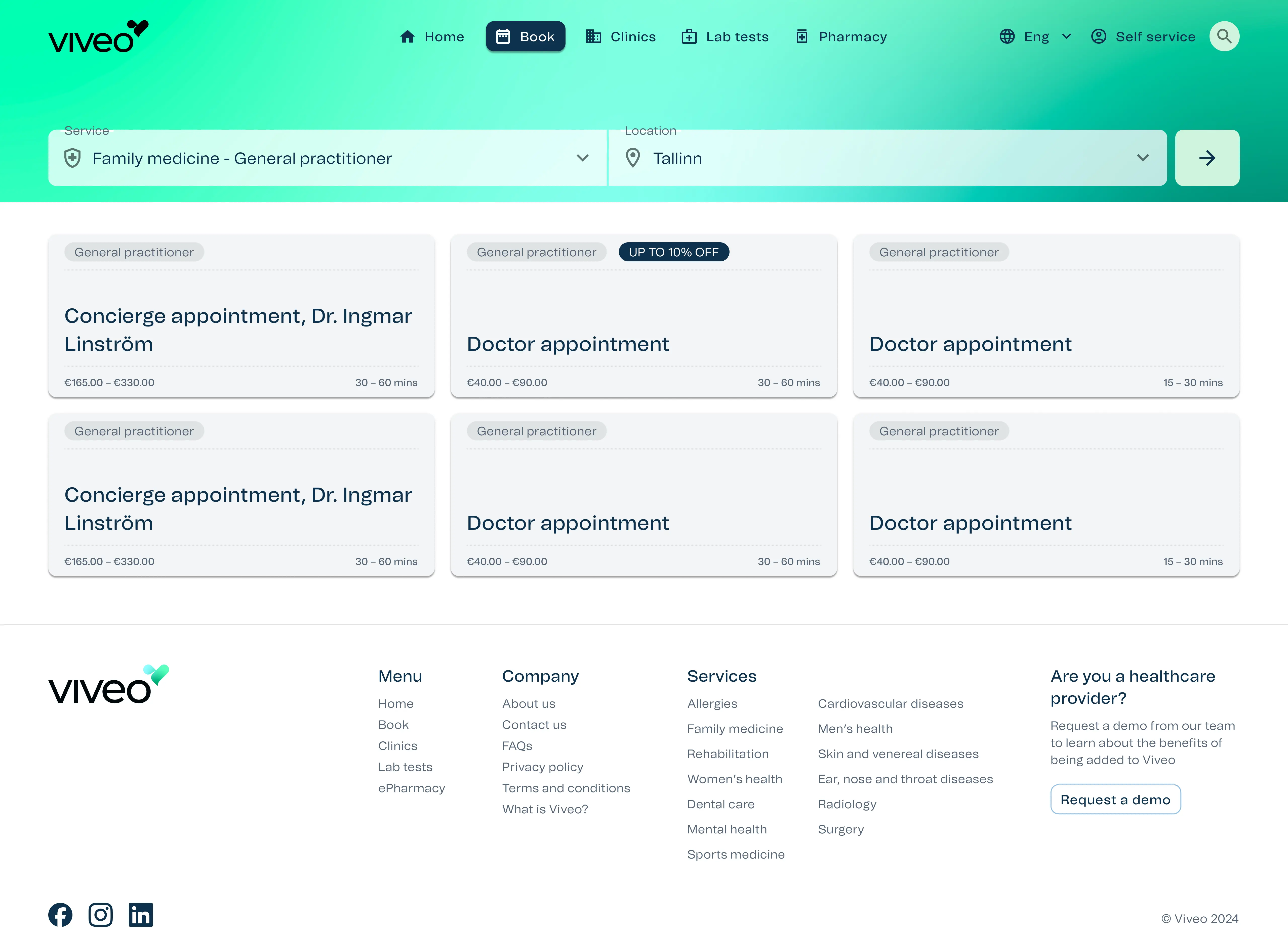
The Search-Driven Hero
The turning point for conversion was moving from a passive landing page to an active search-based booking form. By leveraging mental models from travel and food delivery apps, we enabled immediate intent.
Pattern Matching
Utilizing search patterns from air travel (Location + Service) to reduce the 'learning curve' of a healthcare app.
Contextual Grouping
Consolidating duplicate service names into a single unified entry to simplify provider selection.
Visual Hierarchy
Reintroducing top categories on the home screen to facilitate discovery for non-linear user journeys.
Impact & Growth
Lessons from the Scale-Up
Building at Viveo was a masterclass in balancing legacy B2B constraints with modern consumer expectations. Looking back, these were the pivotal shifts in my approach.
01. Data as a Diplomat
I learned that stakeholder disagreements usually vanish when you present FullStory session recordings. It shifted my role from 'defending a design' to 'advocating for the user' based on cold, hard evidence.
02. Designing for Flexibility
Moving from a whitelabel to a unified product taught me that a rigid design system is a broken one. I had to build components that could look 'at home' across various clinic brands while maintaining Viveo's core identity.
03. The Value of the 'B2B2C' Bridge
I grew to understand that in healthcare, you have two users: the clinician who needs efficiency and the patient who needs empathy. Designing for the intersection of both is where the real value lies.